Wednesday, August 26, 2009

Beautifully Simple


When I arrived one day at a clients house back in June, (with a bouquet of fresh peonies from my garden!) I couldn’t help but notice her guest bedroom was void of night tables and bedside lamps.  It was easy to notice because there was a direct sightline from the hallway outside the bedroom directly to that empty space beside the bed, not that I didn't notice the bed was perfectly made and lovely looking on its own,,,, but just that something was missing.   My designer radar kicked in and as I scoped out the rest of the room I spotted a pretty vintage chair with layers of chipping paint on it tucked in the corner, and then in her home office......a floor lamp that wasn’t being utilized.   5 minutes later,,,,,,,this is what the room looked like (photo above). 


Now the view from the hallway is so pretty, it brings a smile to her face everytime she walks by the room, and to mine everytime I look at this photo.


Often its the simplest changes make the biggest difference and usually they don’t cost a dime.  I love to work with things my clients already own and in my experience, there’s nothing they love more then when they see how beautiful their own stuff looks simply used in a new or different way.   


I admit it may not be the ideal night table or lamp for this room, and one day she’ll find them and the room will evolve over time.  But for now,,,this works just perfectly and is so much better than doing nothing.  I know that often people choose to hold out for that ‘ideal’ piece (if you can figure out what that is!?) but unfortunately that approach usually means you’ll likely end up living with empty spaces and blank walls for years...... there’s nothing appealing or practical about that.


I’m always amazed at the treasures I come across sitting neglected in basements or garages or spare rooms in clients homes.  I’m a firm believer in making the most of what you’ve got before exploring new alternatives.  I guarantee you, you can transform a room or a hallway or an empty corner just by using things you already have.  In fact, you may not even like a particular chair or a lamp or a piece of art that much,,,but by placing it in a new spot or an empty corner it suddenly gives new life or purpose to that otherwise blank space.  Ultimately, its the overall effect that can be created that you’ll love, the colour its suddenly added or the texture, or simply its function.  Even if you’re not so crazy about the individual item(s), you’ll get such satisfaction from the other aspects of how the space suddenly seems useable or more pleasing to look at - you’ll wonder why you hadn’t done it sooner and hopefully it will inspire you to continue building on what you’ve got.


Photo:  Carol Reed

Monday, August 24, 2009

Hgtv Dream House Front Yard

HGTV dream house...

HGTV dream home is simply an ideal home for all those craving for elegance and style. This home is exclusive not only because of the outstanding décor but also because of the grace that it includes. All the guests and the lodgers can surely enjoy a pleasurable time after getting into this home. The front yard of this house is also as attractive as rest of the house.

Hgtv Dream House: Hgtv Front Yard

The best thing about the front yard of this house is that it is not only unique but is pleasing as well. If you ever want to enjoy the architectural legacy of this home then exploring the front yard of this house is perfect options available. The front yard of this house is a perfect blend of architectural legacy and outstanding accessories that makes it most desirable and appreciable part of the front yard.

Hgtv Dream House: Your Dream Front Yard

The most alluring features of the front yard of this house are that it includes oversized light fixtures that make it as attractive as never before. One of the premium facets of the front yard of the HGTV dream home is that it includes era-appropriate plantings that makes the front yard not only eye-catching but unbelievable pleasing as well.

Hgtv Dream House: Small Front Yard

The exterior front of this dream home can be counted as the most attractive, appealing and pleasing corners of this house. Guests can feel like stepping in a royal yard while entering the beautifully decorated front yard of the HGTV dream home. This space is as striking as other spaces of this dream home.

Saturday, August 22, 2009

My Condo - in Canadian House & Home


Canadian House & Home, April 2007 - The condo's Den, Photographed by Michael Graydon.  


After the renovation work was completed it took almost another 2 years for us to finish furnishing the condo.  Early in January of 2007, Canadian House & Home arrived for a photo shoot of our little condo reno and the photos and story were published in the Aril 2007 issue.  In addition to that issue, the kitchen was also featured on the cover of CH&H's special edition Kitchen's 2007 issue, the condo reappeared again in a small feature in their special edition Condos & Lofts 2008 issue, and again in the current CH&H special edition Condos & Lofts 2009.  


Above and below are some of the photos of the condo as published in the April 2007 feature.  The photo of the den was one of my favorites because aside from the kitchen the cozy den was my favorite spot in the condo and where we spent most of our time.   Except for one small pale blue vase, the small yellow vase and a teeny white vase, everything seen on the shelving was our own and displayed as it looked before the photo shoot.  I loved the cube style shelving (expedit from Ikea) which was perfect for displaying our books in stacks but I really loved standing the books up to show off the artwork on the covers and then mixing in my vintage ceramics among them.   When we had dinner parties I used to put votive candles on every other shelf and it became this wall of twinkling candles.  There was lots of room to neatly house my piles of magazines and the baskets across the bottom concealed samples and supplies for my office.   


Canadian House & Home, April 2007 - The condo's Living Room area, photography by Michael Graydon.


Canadian House & Home, April 2007 - The condo's kitchen, photography by Michael Graydon.


Canadian House & Home, April 2007 - The master bedroom, photographed by Michael Graydon.

Canadian House & Home, April 2007 - The condo's office nook, photography by Michael Graydon.


Canadian House & Home, April 2007 - The condo's master bath vanity top, photography by Michael Graydon.


Canadian House & Home, April 2007 - The condo's laundry closet, photography by Michael Graydon.

Canadian House & Home KITCHENS 2007 - Cover, photography by Michael Graydon.

Anyone who knows me, knows I'm not personally a fan of pastels or bright colours, not in my wardrobe or in my home, so I wasn't the happiest of campers when I saw all the pastel and citrusy coloured accessories the editor and stylist brought in for the shoot.  In turn, I could see they were disappointed that all my sheets, towels and dishes were plain white and... that I refused to give in to them when it came to the pastel pink kitchen aid mixer.  I realize those colourful touches were brought in to make the space look more 'spring' like, and that it did, but I have to say I couldn't wait to put everything back the way I normally live with it. It was an interesting experience to see my own space styled and photographed thru someone else's eyes - and despite the anxiety I had about all that colour, I think the end result was beautiful.  How could it not be with Michael Graydon behind the lense!!  

In comparison, below are some of my own photos of the condo, taken in the months or days before the CH&H photo shoot and how it normally looked on a day to day basis (well, excluding the dishes on the dining table!).


Photo Credits:
First 7 photos by Michael Graydon for CH&H  
Last 4 photos - Carol Reed 

Tuesday, August 18, 2009

My Condo Renovation - Design Drawings


After - The Final Layout


DESIGN DRAWINGS:  Part of what I’d like to use this blog for is to share some of my work, not only before and after photos but also the design drawings, sketches and inspirational concepts. They represent all the months and sometimes years of work that have had to take place before those lovely ‘after’ photos can be taken.  For past projects, I’m going to start by going back about 6 years, or about as far back as the files date on my current computer.  Anything older than that,,,,and I’ll have to start digging thru the boxed archives.  Which i’m sure I’ll do eventually but in the meantime,,,,, I’ll start circa 2003 with one of the oldest living projects on my hard drive now, it also happens to be the FIRST time I had the opportunity to design a home for myself!   If you haven’t read my earlier post or seen some after photos of my condo you can check it out here.  


BEFORE:  When my boyfriend and I decided to buy a place together, our search for our ‘dream’ home didn’t last long, I don’t even remember how we ended up looking at condos, that certainly wasn’t my intent,  but it is true when they say that location really trumps everything else..... and, that men really don’t like change.  Did I mention this condo we bought was located directly below the unit my boyfriend was renting at the time.   Oh yes you could say,,,we searched high and low for our new place. ; ) 


And this is the condo we bought .......


The combination Living Room/Dining room featured a stippled popcorn ceiling, cheap, plastic like laminate flooring, ugly aluminum windows,,, and a stunning view.

The kitchen 'Before' - viewed from the Living Room.

Despite the kitchen was 20 years old, it was in like new condition.  The condo had only one previous owner, a single male and the unit was immaculately well kept.

Guest bathoom and Master Ensuite below, vintage 1983. 

The master ensuite.  

DEMO:  And about  one week after taking possession,,,,,this is what our condo looked like!


The blue stripe on the wall was where the old kitchen was.

THE AFTER SHOCK:  This is the stage in every reno project when the homeowners feel overwhelmed with anxiety, it marks the beginning of many sleepless nights.  Your home, typically your single biggest investment, has suddenly become a pile of rubble and you can't imagine it ever being livable again within the time frame or budget you've allocated.  


It was after the demo stage that most of the design plans for the condo got reworked and finalized.  We discovered all sorts of conduit and telephone/cable risers in places we didn’t expect, right smack dab in the middle of our new wide open plan living spaces.  Discouraging to say the least.  They weren’t indicated on the base building plans that the management office had provided so we had no idea what we'd find once the walls came down.  And when they did, I had to quickly figure out how I was going to work around all these obstacles without chopping the place up again and building bulkheads everywhere. All that conduit you see hanging down from the ceiling and sticking up thru the floors,,,,had to stay, but i wanted clean, high ceilings.


Despite all those 'surprises' I was excited to see the place demolished.  Aside from the view, there was nothing I liked about the unit.  I hated the layout.  The tiny kitchen on the interior of the unit was completely enclosed with full height walls, essentially blocking a spectacular view - which made no sense to me at all.   As for the 45’s, I can’t even begin to tell you how much I hate 45 degree angles (I’ve always thought they’re a lame way of trying to making something fit that otherwise doesn’t fit - and people might think its a ‘creative’ solution, but i think it just looks like something was lopped off.)   And then there’s that interior bedroom with sliding patio doors,,,,,and the fact that there was no balcony.


Here’s a look at the demo plan - it shows what the existing layout was like when we purchased it, and everything we planned to remove is indicated by dashed lines.  Basically, we stripped it back to the concrete shell leaving only the plumbing stacks and conduit in place. 


PRELIMINARY PLANNING: Before we even submitted an offer to purchase the place, I took a site measure, drew up the plans and starting sketching.  We had to satisfy ourselves that we could make the space more useable for us, and do some quick estimating on the costs and time involved.  This only took a day or two.  Below are some of my really rough sketches (and I mean rough), probably done in a coffee shop.  Despite how rough the sketching looks, when i look at these now i can clearly see my thought process and how the final plan evolved.   I always freehand sketch dozens of ideas before I ever start to draft anything up on the computer, i had piles of these rough layout sketches.  To this day, that condo remains one of the most challenging spaces I ever worked on.  A huge angled wall, very little wall space,,,,foor to ceiling glass,,,,,,furniture placement was impossibly awkward.  I never was completely satisfied with the layout but for us, it was a a big improvement to what was there before.


SKETCHES:  We wanted to maximize the views of course, I love to cook and have dinner parties so I wanted a kitchen that was condusive to entertaining large and small groups, I wanted undercounter, side by side washer & dryer set up, not a tiny stacked unit squeezed in an even tinier closet,,,I wanted a separate cozy tv/library area, a small home office space and an entry way that was inviting, private, and could accommodate 3 or 4 people comfortably with lots of storage for coats and boots.


PARTITION PLAN:  Here’s the final partition plan which shows where all the new walls, cabinetry and bulkheads were to be built.   The Den area ultimately underwent a second phase of construction a year or so later when we added walls and doors to create a more separate tv/bedroom and office area (shown in the final layout at the top of this post). 


OBSTACLES & SOLUTIONS:  The circular columns you see in the front entry and beside the kitchen island were my solution to concealing vertical risers that housed telephone lines for the floors above.  These were fibreglass like columns that came in two half round pieces which the drywallers tape and mud together. They looked like the large round support piers you often see in high rise condo's and lofts which was much more authentic looking to me than building a small drywall box around them, now they became an architectural feature. They weren't classical greek columns, they were simple, plain cylindrical unadorned columns. They actually look like they could be part of the structure and to me they had this nautical feel about them too.  There was another set of oddly placed risers that you can see in the Den, about a foot and a half away from the wall.  I decided to have a wall built out enclosing them with a second matching wall built to the left of it so that it created a nook.  We outfitted this nook with a lower cabinet to house a large colour printer, then a tv cabinet above that on a pull out swivel shelf and recess pocket doors, then a small upper cabinet above the tv housed the tv receiver box and dvd player.  The size of the nook was designed so that we could fit ready made Ikea cabinets within it, the walls and the cabinetry were the same white colour, in the end it all looked like custom built-in cabinetry and you'd never know the entire thing was built to conceal some conduit. 

KITCHEN DESIGN:  I love to cook and the newly designed kitchen was truly one of my favorite kitchens I’ve ever cooked in.  I really like the single lineup against the back wall, if i could have added a second prep sink to the island it would have been ideal, but that wasn’t possible.  It took me a while to get used to the size of the island,,the day the concrete counter was installed, I couldn't help but think it was so big it looked like a landing strip, the only thing missing was a stripe down the middle.  It was big.  But I adjusted to it quite fast and once the rest of the space was furnished it didn't seem so big anymore.  It was awesome for entertaining, we always had 3 or 4 people sitting at the counter enjoying wine and cheese while I cooked and chatted. On a daily basis we ate all of our meals there and it was great having a flat panel tv mounted on the opposite wall. 


Here’s a look at some of the kitchen elevations.


HIGH & LOW:  The entire renovation was an excercise in mixing standard off the shelf stock products with custom elements and details. The kitchen is a great example.  The cabinets were all from Ikea but I custom finished the cabinetry in a dark brown stain and the pantry and fridge cabinets I painted in white ( back in 03/04 they didn’t have as many door options as they do today).  I went with a counter depth fridge and had full gables istalled on the sides with a cabinet above to give it a true built-in look.   From the money i saved by going with stock cabinetry, I splurged on good quality stainless appliances and then pretty much everything else about the kitchen was custom.  Custom concrete counter top on the island, a stainless steel back counter with integrated custom single bowl sink, custom back painted glass backsplash, custom stainless steel floating shelves and stainless steel back panel on the cooktop.  Which all took an incredible amount of precision planning and co-ordination, the smallest oversight or miscalculation easily becomes a really costly mistake.


I had no choice but to drop the ceiling over the kitchen to accomodate electrical conduit so i designed a low profile, two tier bulkhead that looked like it was integrated with the design of the kitchen, it followed the shape of the island then returned back to the wall so it lined up with the range and rangehood.


DETAILS:  When i look back now, I’m surprised at how much custom work went into the condo because we really had a modest budget.  I'm also surprised at how much the marketplace has changed and the range of products that are now readily available at big box stores that we didn't have just 6 years ago.  In addition to the custom elements we installed in the kitchen, some of the doors, all of the baseboards and casings and even both vanities in the washrooms were custom made based on my own designs.  Some of those designs were planned before construction started,,,some were designed on site and sketched up by hand.


A custom vanity designed of a stainless steel frame and concrete countertop.  The wall tile pattern wasn't finalized at this point.
A custom floating vanity in the second bathroom which also served as a powder room so I wanted it to look more elegant and not so utilitarian bathroomy looking.  The wall tiles that were installed were actually 12 x 24.


Above is a detail sketch of a concealed bracket for the floating vanity.  Although I prepared an elevation with written notes that illustrated the design intent for the floating vanity, the contractor and cabinetmaker needed more direction on exactly how to make it work.  And I'm always prepared to do that with anything I design.  In addition to this custom steel bracket I also provided 2 different options for ready made brackets from a hardware supplier. 


Both of these casing and baseboard profiles I’ve used a few times since this project.  I couldn’t find a supplier who had these profiles in these sizes so my contractor just milled them for me.   Today I still don’t know of anyone who makes a paint grade baseboard in this profile that’s less than 7-1/4”.  But i’m pleased to say that Brenlo recently added a new casement profile to their catalogue and its exactly like this one I’ve been having custom made. 


Just think, all of this and we havn't even touched upon colour, finishes, lighting, fabric or furniture!!!   My next and final post on this condo renovation will feature more of the after photos and the House & Home photo shoot.


Monday, August 17, 2009

HGTV Gardening Tips

HGTV dream house’s gardening tips

To get a perfect garden there are certain consideration that must be kept in mind in order to get the desired gardening results. They include:

Hgtv Dream House: Gardening

Start small

The finest method to start gardening is by selecting a relatively small area, a minimum 100 sq ft. Within this region, you can grow loads of plants than you may think. Also, small garden are easily manageable. Starting with making small garden is the perfect way to get some knowledge about basic gardening.

Hgtv Dream House: Gardening tips

Maintain healthy soil

Try to stay away from the soil in the established garden, since walking over that will make the spoil compact and consequently will make it tougher for the plant or grass roots to grow. Design paths, rows or set a board over the soil near to the regions where you are working. Also avoid working o the soils while it is wet. Or else, when it will dry, you will conclude with huge hard packed soil clumps.

Hgtv Dream House: Color your Garden

Mulch

Mulch suppresses the weed growth in addition to maintain the soil moisture as well as stabilizes the oil temperatures. Mulch each and everything in picture with any kind of organic mulch you want to.

Hgtv Dream House: Colorful Garden

Water adequately

Do not water much for just brief period, as doing so can cause the plant roots to float over the soil surface. In place of this, deep soak every time you water in order to encourage the roots to expand deep down within the soil. Always remember to water the plants in early morning, so the plants will get a chance to get dry during daytime. This will further assist in minimizing all kinds of fungal disease.

Hgtv Dream House: Big Garden

Taking care of your garden will certainly give you he desired look of your garden as well as will assist you in developing a new hobby of gardening.

Saturday, August 15, 2009

The Windsor Chair

Interior by Tom Sheerer


I admit I have a thing for chairs, especially timeless classics whether it be a classic modern or classic traditional, I have a list of personal favorites that includes both and regret that I can’t somehow own all of them (but I'm working on it!).   I’ve always loved the lines of a windsor chair because the spindles and the graceful arc have such a graphic quality to them and they evoke a nostalgic sense of hand made craftsmanship.   I love how their elegant lines compliment both traditional and contemporary spaces.


Modern Country model home by Toronto designer Yanic Simard


In case you haven’t noticed, windsor chairs are HOT right now - I’m seeing them everywhere.  I would never categorize a windsor chair as trendy but like many classics from the past, they are definitely expieriencing a renewed appreciation from a new generation.  I first took notice about two years ago when i was recommending some for a clients kitchen and noticed their popularity seems to have grown since then.   Its hard to pick up a shelter mag lately without seeing them in a feature story or advertisement.  Last week while I was out sourcing chairs for a client I spotted them again and again, in even the most modern of furniture showrooms.  


P.E.I. Beach Home of Canadian Pamela Kline as featured in Country Living

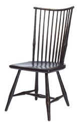
Windsor Chair in distressed Black from the showroom of Sharon O'Dowd.

I'm partial to these chairs in high contrast black because it emphasizes those great graphic lines (like in the photos above), especially in white spaces,  but for clients I’ve often recommended them in a fresh colourful hue which makes them look like striking pieces of art.  


Red Canadian Maple windsor Chair from Toronto shop Commute Home

Tourquoise windsor chairs photographed by Karl Juengel via Brabourne Farm

A 1948 modern version, George Nakashima's straight back chair as seen at Toronto's Design Within Reach showroom. $700.

The Salt chair available at Design Within Reach.  $120

Crate & Barrel's Ingram Side Chair emulates the classic bird cage back windsor chair.  $250.


Martha Stewart's Everday windsor chair for Kmart was flat packed and sold ready to assemble for a mear $49.  For that price I wouldn't be able to help myself from taking a paint brush to them and going crazy,,,a beautiful chartreuse green perhaps....
 
The complete family of windsor seating also includes stools, with and without backs.  Windsor bar stool by Toronto's Windsor Workshop.


The famously beautiful kitchen of Nancy Meyers (Somethings Gotta Give) by designer James Radin as seen in House Beautiful.  He describes the windsor barstools as being "like a punctuation mark in the room".

24" Windsor bar stool by Toronto's Windsor Workshop.

Rod Back windsor chair in black by Toronto's Windsor Workshop.


Large comb back windsor arm chair by Toronto's Windsor Workshop.


An elegant large comb back windsor chair seen in this Sunroom by designer Michael Smith for a Millbook New York Farmhouse as seen in Elle Decor, photo via Cote De Texas.
Windsor Settee by Toronto's Windsor Workshop.


I think a perfect way to add some graphic interest or that "punctuation mark' to a hallway or foyer is to use the graceful windsor settee.  Unfortunately I was unable to find a photo of a windsor settee in this setting,,,,,so you'll have to tap into my designer vision with me here.......If I was to furnish a hallway or foyer with one of these beauties, I could easily envision them in hallways that looked like these....

Stone hallway of a model home toured by Cote De Texas.  How perfectly striking would a black windsor settee look in this gorgeous white and stone hallway.

How about a windsor settee painted fresh spring green or crisp white in this modern traditional home.


As beautiful as this rustic bench looks in this foyer, I can't help but think how perfect the curved back of a windsor settee would echo the rounded top of the panel door.


It would be easy to picture a black or white windsor settee in this modern panelled entrance hallway but with this neutral grey panelleling a windsor settee in any colour your heart desires would be a graphic pop of unexpected colour.