Showing posts with label renovating. Show all posts

Saturday, July 17, 2010

Gail's Kitchen Reno: Post #3- Progress


Its been 3 months of debris and dust.....finally its time for all the new finishes and fixtures!

After 3 months of demolition and new construction we're finally getting to all the exciting finishing details at Gails' Kitchen.  Just when it seems like things are moving along at a snail's pace, suddenly you hit a point when everything starts to come together quickly with visible progress every day.  Its like Christmas morning each time I visit the site now!!  While the contractor's been working on the new construction I've been finalizing a few design details like the fireplace surround, ordering light fixtures, sourcing some new stools and finalizing the hardware selections.


A couple of weeks ago we purchased the Ikea cabinets which were delivered next day - and I have to say this will be my LAST Ikea kitchen order unless they're willing to pick it for me.  What you're seeing above is only half the order (there were 2 more carts, 5 in total!) that we had to physcially pick off the shelves ourselves load onto carts, haul thru the warehouse, thru the cashier and then to the delivery desk.  Its absolute insantiy!!!  Not only did we risk losing a toe or breaking our backs - this stuff is heavy its just plain dangerous for customers to have to do this. The entire process takes about 2 hours and backs up the checkout lane for EVER.   This kitchen is beyond a reasonable size to attempt to purchase from a self serve warehouse and its not much bigger than most of the kitchen they have on display in the store.  I don't recommend anyone attempt this unless Ikea changes their procedures back to the way it used to be (they used to just give you a piece of paper to take the cashier).  For the record all the other customers in the store that day who witnessed this caravan of carts stood in awe and vowed they'd never buy an Ikea kitchen if this is what it involved.  So I'm done complaining to them about it, I'll just stop buying them.

My absolute favorite part of any job is when the primer goes up.  I LOVE to see the new space painted entirely white, in many cases its the only time I get to enjoy the beauty of the whiteness of the space before the clients 'colour' goes up!  Personally I always think the spaces look better in white,,,, but hey,,, its not about what I want because its not my house.


When the hardwood flooring arrived on site I handpicked all the boards.  I specified a character grade wood that has lots of knots but which also means you can get lots of variance in the appearance with some really odd ball pieces thrown in there too.  With this much character in the wood its important that the boards are thoughtfully placed or it could look like a dogs breakfast, so I sort them into 3 piles of bad, good and best.  Instead of tossing out the 'bad' boards I have the installer use them in areas where they won't be visible like under all the kitchen cabinets, under the appliances and under the sofa.


I sampled 7 shades of yellow paint before we could find one that we were happy with.  Yellow has to be one of the trickiest colours of all to get right, it doesn't help that I'm not a yellow person but I appreciate my client's attraction to it.  We applied each of the samples on three different walls and not only did the yellows look drastically different on each wall, the same colour often looked totally different on the same wall.  Looking at all these samples above, except for the two whites the others looked nothing like the paint samples in hand, NOTHING.  From left to right, bottom row we have; BM Creme Brulee, BM Creme Fraiche, BM Affinity Soleil, F&B Cream, F&B House White, BM Cotton Balls, BM Spanish White (LOVE), BM Ivory White (LOVE).  Top row is a second sample of BM Creme Brulee which looks nothing like the sample on the far left.  The homeowner didn't pick either of the ones that would have been my first choice but she's madly crazy in love with the one she did pick!


I was so excited a couple of weeks ago to meet the Coppersmith at the house and review samples of antiqued, hammered copper. He'll make the copper patina to our exact liking and then he'll use it to build us a custom hood canopy exactly like my design sketch - I can't wait to see it!!!!


But before the Coppersmith left the building,,,,,I lured him into the family room and pulled out my design sketches for the fireplace and asked him if he could use that same copper to make a surround for the new fireplace.  No problem he said, piece of cake.  Now, that's the kinda response I like to hear!!  So he'll be back to measure for the surround as soon as the gas fireplace box is installed.


Nothing gets my heart beating faster than found treasure,,, and an enthusiastic contractor. : ))  My clients are currently living in one of their own rental properties during this renovation and in the garage of that house we found stacks of antique wood boards from the previous owner who was a woodworker.  I couldn't believe my eyes when I saw these beauties piled up in the junk pile.  With their live edge and the gorgeous wood grain my mind was realing thinking of all the different ways we could use these.  I sketched up a detail for a sliding barn style door and Tom's going to have these boards made into an oversize door panel, and then,,we'll use the rest to make the mantle for the fireplace.


They started installing the base cabinets on Wednesday....


By Monday we'll be ready for the counters to be templated.  


Meanwhile the cabinet doors and drawer fronts are off getting sprayed a perfect shade of white.  Check out this post for all the details we have planned, and check out this post for step by step process of how I have Ikea cabinets custom sprayed (note this is not a DIY project!).


Stay tuned for more updates over the next 4 weeks as this dramatic kitchen, family room transformation comes to completion. 


All Photos:  Carol Reed

Friday, April 9, 2010

Before & After: E-Design Bathroom Project


I received a wonderful surprise in my inbox this week from a client who I had done some work for last September.  Much to my excitement, she had emailed me some 'After' photos!!   I love to see photo updates from my clients, but these particular photos were exceptionally exciting.   This time, this wasn't the usual full-service design project where I was involved from beginning to end, spending much of my time on site and seeing the progress along the way etc..,,,,,,in fact it was quite the opposite -  this client came to me thru my e-design website, thedesignshop.ca.  Which means I've never met this client in person or ever stepped foot in her house, although I feel like I have.   So I was beyond thrilled to see this bathroom transformation thru the photos she sent me. (wait til you see the 'befores'!!)

thedesignshop.ca is a website I launched a little less than one year ago - its an affordable and accessible way to receive a comprehensive design plan, prepared by a professional Interior Designer then delivered right to your in-box.  The entire process takes about 3 - 4 weeks and is suitable for those who live outside the Toronto area and/or those seeking design advice but are willing to do some of leg work themselves.  In this case, the homeowner ordered a Bathroom Redesign for the main bathroom in her victorian rowhouse located in a historical neighborhood in Toronto.  When she ordered the e-design service, she emailed me a site measure of her bathroom, photos, and all of her requirements.  In return I asked her to complete detailed surveys relating to the house, her lifestyle, and her preferences and then she sent them all back to me along with a few inspiration photos of bathrooms or elements that she was drawn to.  With all that information in hand,,,,,I was able to re-design her bathroom and deliver a comprehensive design plan to her complete with all the relevant information she would need to purchase all the products and hire a contractor to build her new bathroom.   After sending her the completed e-design package last fall, I knew I had hit the target when she replied telling me how happy she was "when i opened up the attachment and immediately saw the moravian star fixture I knew you had captured my idea of a dream bathroom".  Soon afterwards she sent me an update saying she had hired a contractor and they were looking forward to starting the reno in January.  Aside from one question about the size of the vanity drawers (her contractor thought they would be too big?) I havn't heard from her again...............until this week.  And - its all done!

But before I show you the after's,,,,you really need to see the before's to appreciate what a dramatic transformation this was.


The Before's......

Sink Vanity with hollywood lights


Tub/Shower enclosure with cedar clad walls


Wall to the left of the window with brick chimney wall and cedar cladding

The last time the bathroom was 'done' was in the early 80's, and with all that cedar cladding and the hollywood lights, the homeowner described this style as 'Sauna Chic'.  It was the main bathroom in the house for her and her husband and two adult sons, their only other bathroom was a 2pc in the basement.   The great features about the room were that it had good high ceilings and a wonderful big window with  a gorgeous view of a leafy backyard garden.  


The Inspiration.....

A collection of images that illustrate various elements and design details to be used as reference for the new bathroom design.


 She loved the charming timeless character and warm colours of this traditional bathroom.  I proposed either a panel moulding wainscott detail or a painted beadboard wainscott which would work equally as well.


She loved the understated and simple lines of this classically inspired bathroom with its contemporary styled plumbing fixtures and furniture style vanity. Also high on her wish list were clean lined vessel sinks and single lever faucets.


She loved all the traditional details here but wanted something warmer in colour for the walls. 


The Design Plans....
First I emailed her two preliminary layout options for incorporating a separate tub and shower which was the main objective, but the toilet and vanity locations remained the same.  She decided to go with a drop-in style tub with a tub deck and skirted front.  So the rest of the design plans were developed from there.


The final floor plan.


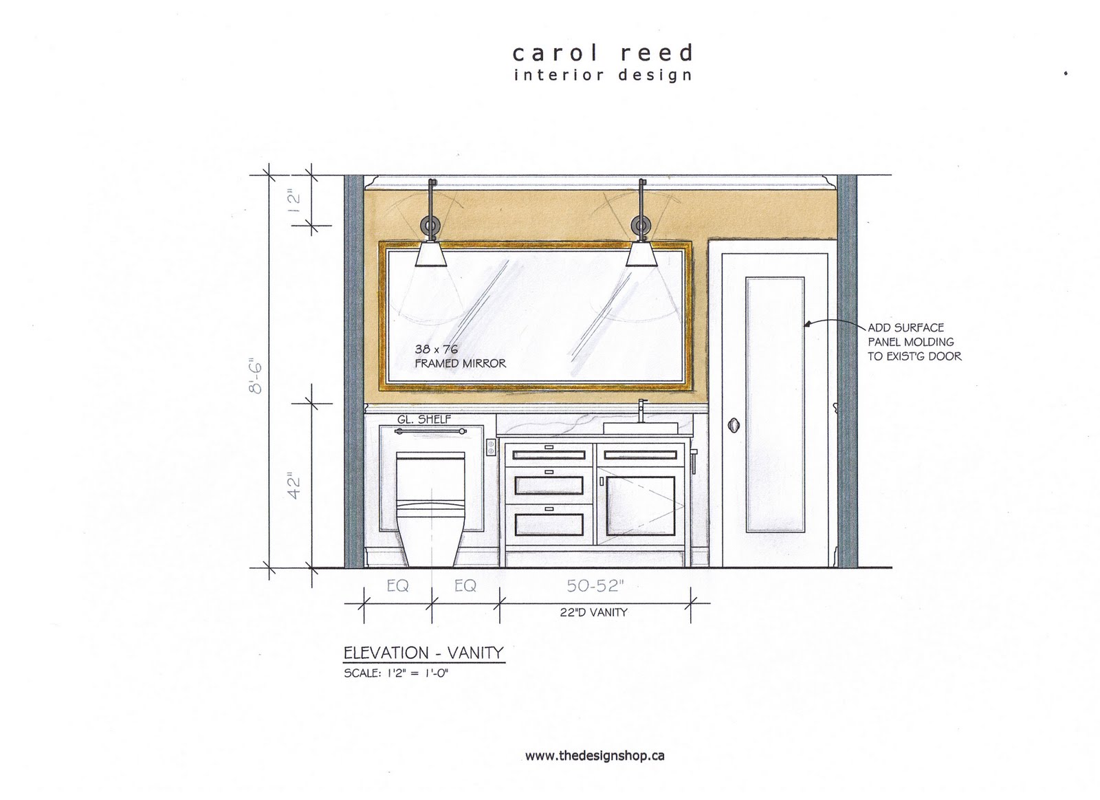
This is the Elevation at the window wall showing the new tub surround and seperate shower.  The tub selection was key as we needed to find one that was low enough to be installed under the existing window and one that had simple clean lines.  This new model from Duravit fit the bill perfectly!


This side elevation shows the half wall with glass between the tub and shower.  The paneled wainscotting and crown moulding added that traditional character to the room.


I had provided her with 3 options for the vanity wall, one option had a smaller mirror over a centre sink with scones on either side and a storage cabinet over the toilet, she had a hard time deciding as she really liked both, but in the end, she opted for this option with the large mirror and lighting above. 

In addition to all the drawings above, I also provided her with a list and photos of all recommended plumbing fixtures, light fixtures, hardware, mouldings, tile, window treatments and accessory selections along with sources and approximate costs.  You can see more images of this e-design package on thedesignshop.ca website sample gallery here.


The After's.....

The email I received from my client this week along with the 'after' photos was quite a surprise.  I received a short note from her along with some photos.  It was eloquent, and precise just like I imagine she is. "my bathroom has been complete for two weeks and I must say its the most beautiful bathroom I've ever seen. When the mirror was put up I had tears in my eyes..."


I proposed both a vessel style sink option and an undercounter mount,,,,,along with two faucet options of either a single lever or widespread.  I was surprised to see she didn't go with the vessel style sink, but I think this looks great too!


I also provided several ligh fixture options.  Often this decision is determined by what's available for when you need it, especially when you need two of them.  You can see on the design board (2nd photo from top) that not everything illustrated there is seen in the after photos, however, the final choices made were from alternate options provided in the design package, so there is always flexibility of choice offered to the client.


Well what can I say but - so beautiful!  Even without any professional styling or photography, the bathroom looks stunning.  These photos were taken just the other day and the bathroom has only been complete for 2 weeks so I imagine she'll be adding a few more accessories or artwork in the future.  I can't begin to describe how impressed I am with the results and congratulate her on doing such a stellar job!!   To realize what this homeowner accomplished - implementing this project on her own with a set of plans and written instructions is inspiring.  I think these images speak volumes to the importance and value of investing in a good design plan, but then again, this client is an Academic by profession so she was wise enough to recognize that! ; )

Since this house is located in Toronto, I'm making plans to visit in person before the end of next month so I can take some of my own after photos.  I'm looking forward to meeting this client in person and she's looking foward to relaxing for a bit, pampering herself in her new bathroom and getting ready to start her next e-design renovation project......the kitchen! 


Monday, March 15, 2010

Chalkboard Door:


Masonite's new Chalkboard Panel Door

Chalkboards continue to be one of the most popular details or accessory I'm asked to include in a newly designed room whether I'm designing a new kitchen, mudroom, playroom, kid's rooms, home office or even a laundry room - everybody loves the idea of having a place to write to-do lists, appointment reminders and personal expressions.  The home kitchen I'm currently designing for a chef is no exception, my client really wanted me to find a spot somewhere in her new kitchen for a blackboard so she could post menus and make note of special celebrations.  Like most kitchens,,,because of all the appliances and the cabinetry there's not a lot of wall space left over for artwork or message boards.  But,,,,,,in this particular kitchen there is a door that leads to the basement which also happens to be highly visible from everywhere within the kitchen - so the obvious solution was to incorporate the chalkboard with the door.

A chalkboard door is something that can easily be made with a plain door and some blackboard paint, however, if you don't have the time, the skills or the desire for a DIY project and/or you want a genuine style and rail door that's ready to hang then this new chalkboard door by Masonite is a great option.  These doors come available in either a single panel or double panel style with the washable magnetic chalkboard surface on one side in a selection of wood frame or primed MDF,,and can be ordered either with the hinges already machined in place or not. 


Primed MDF, Single Panel Option


Clear Pine - Double Panel


These doors can be ordered anywhere that sells Masonite door products, including Home Depot where the cost for a 30"x 80"door in primed MDF is $309, and $360 for a double panel (non-machined).  The same size door in clear pine is $322/single panel, $374/double panel.  Delivery is approximately 3 to 4 weeks.  You can check out the Masonite website for all the options.


All Photos:   Masonite Door

Monday, October 26, 2009

Victorian Row House: A Designer Reno on a DIY Budget - Part 1


The front exterior After.  

In March of '08 I was nearing the end of a major client reno (and living in our rental house), when my brother told me about a property for sale that he had just seen - it was in a hot up and coming Toronto neighborhood but was in dire need of a complete interior reno.  Since he was going to have some time on his hands for the next 5 to 6 months he suggested the idea of purchasing the property and reno'ing the house together as a joint project - he’s an excellent rough carpenter and very experienced handyman.  For him it was short-term work, for me it would offer me the opportunity to be my own client, design a renovation for myself......and have the option of moving into the house if I chose or sell it depending on how things went.


We bought the house pretty much on the spot, and in a bidding war with 3 other buyers.   The seller was an elderly gentleman who was quite sick and would be moving from this house into a hospice.  As much as I hated paying  over asking price for the house, it was gratifying to know that the funds from the sale were much needed and would be well used to provide for his care giving.


The house was a 1913 row house with a 1980's addition on the back, the house was surprisingly much larger than it appeared from the outside. It was a 3 bedroom, 3 washroom house with the added bonus of a family room off the kitchen, a finished basement with 8' ceilings, a fenced private yard with a large deck and a private 1-1/2 car garage.  Here’s a look of some of the before shots,,,,,,,and all I can say is that it looked better than it smelled.   This house was NASTY, with a capital P.....Ewwww. 


The front exterior before.  I instantly fell for the original 1913 brick facade and the huge old tree.  There were wonderful corbels across the top of the facade that aren't visible in this pic.  The bright yellow door was an indication of what we'd find on the inside....

There wasn't a trace of victorian character inside  the house however, it had undergone a builders reno in the early 80's.  Someone must have found a deal on orange and yellow paint - it was everywhere!


There was evidence of water damage everywhere, notice the kitchen ceiling.  A new roof had eventually been installed 2 years earlier but none of the prior water damage had been repaired.  The cabinets were barely hanging on the wall, they were rotted right thru the back.


The upstairs hallway.  The smell was utterly foul, those are urine stains on the carpet and there was animal feces everywhere.  We were told the place had been used as a rooming house for many years.  I did like the skylight and all the natural daylight it brought to the stairwell and hallway.


A tiny ensuite bathroom off the back bedroom on the second floor.  The only working toilet of 3 in the house.  The vanity cabinet was about 15" wide with the worlds smallest sink.  The stencils had been spray painted on the walls throughout the bedroom too.


The main bathroom on the second floor.  Niether the toilet or tub were functional.  The black hole in the ceiling above the shower was rotted thru to the roof from the previous leaks.  I loved the amount of daylight from the skylight and surprisingly it was actually in good shape with no signs of leakage.


The basment had a 2 pc washroom, but the ceiling height was only 5'-11".  And when you flushed the toilet it just drained onto the floor (good thing there was a floor drain!) and you can see the black water line on the sink cabinet from a perpetually leaky sink.  


The laundry room beside the washroom was narrow and also only had six foot ceiling height.


Despite the extremely poor condition of the house I realized it had a lot of desirable features, tons of space and loads of potential.  Because this house would be a short term investment for me, the decision to buy was all about the house’s resale potential, and when it comes to affordable single family homes in the city, this house checked all the boxes:

  • location (10 min to downtown)
  • public transit on corner
  • 3 bedrooms
  • 3 bathrooms (2 on the second floor - rare!)
  • famiily room off kitchen
  • PARKING with Garage
  • victorian facade
  • thriving neighborhood ammennities, 1/2 block to starbucks, organic butcher, organic bakery, juice bar, cheese boutique, schools, and a slew of some of toronto’s best and hottest new restaurants and cafes.
  • 2 big beautiful mature old trees, one in the front, one in the back
  • with a finished basement, it offerred 1800 sf of living space


Here's a look at the floor plans for each level of the house with the existing 'Before' plan on the left and the proposed 'After' plan on the right.

The Basement

BEFORE:  The basement was finished but as you can see from the pictures above it was in rough shape. There were 3 distinct areas, you can see on the plan all the way up to the powder room there was a clear ceiling height of 8', which was amazing, but the washroom and laundry room only had 6' high ceilings. Beyond that was crawl space only.  There was also an oddly large closet at the bottom of the stairs complete with a light and baseboard heater. 

AFTER: I moved the washroom to where the large closet was (which I felt had been intended for a washroom originally).  Now we had a full size powder room with 8' ceiling.  The bottom of the stairs would become a mud-room area with a bench and coat hooks (as there was no coat closet on the main level) and the powder room would service guests on the main level when entertaining.  I relocated existing leaded  glass french doors from the old kitchen and installed them between the landing and the main area of the basement.  It added lots of character and made the space seem larger, grander.  This could serve as an office, a guest room or tv room with the ability to close-off the room if needed for privacy or noise control.  The laundry area was now spacious and I felt that a 6' ceiling height was still workable as many laundry rooms had low ceilings and were in unfinished dingy space - this would be a clean bright fully finished space with a long counter.

The Main Floor

BEFORE:  A half wall in the entry way, a delapitated kitchen with a set of doors between the kitchen and family room.  The kitchen was interesting because it was elevated, however, the traffice flow also went directly down the middle of the kitchen and there was a wall of baseboard heater on one side.  There was a beautiful view through to the backyard where there was another huge old tree.  

AFTER:  We decided not to get into any structural changes and left the walls between the existing kitchen and family room.  The new kitchen layout was designed to gain maximum storage by installing an entire wall of pantry units with toe kick heater underneath.  Also part of the plan for the kitchen was a freestanding island, not shown in these plans.  New single pane french doors were added that enhanced the view to the backyard.  A full height wall with a niche was added in the entry way, giving more privacy and weather shield when the doors were open - I considered enclosing it by building a vestibule with a second door but it would have required relocating and adding a light, a switch and a baseboard heater.  I opted not to do this at the time but built the wall to a dimension that could accommodate a second interior entry door in the future (it was actually a bit longer than shown on the plan above).


The Second Floor

BEFORE:  The layout was interesting as there were two levels and 2 washrooms which is rare in a house of this size in the city and the bedrooms were all good size.  Ensuite washrooms are always highly desirable and considered a premium feature.  Two skylights brought in lots of natural light but the tiny size of the ensuite bathroom and tiny closets were the weak points.

AFTER:  I reconfigured the ensuite bathroom in the back bedroom by essentially just mirroring the layout of the main bathroom but with a walk-in shower instead of a tub/shower, and relocating the closet (also larger) to the inside of the bedroom.  I made sure this back bedroom still accommodated a queen size bed, two night tables and a dresser which it did very comfortably.  I decided to double the size of the front bedroom closet by eliminating the tiny closet in the middle bedroom.  I envisioned the middle bedroom being used as a nursery or home office and concluded that a wardrobe unit or armoire and chest of drawers would provide adequate storage in lieu of the old closet.  Now the front bedroom had a closet more suited to the generous room proportions. 


Stay tuned for Part 2 on this Victorian Row House Reno,  I’ll take you thru the reno budget,,the strategy, and post lots more after pictures with an overview of each room, the design process and some of the cost saving details and products that were used.  Below is a sneak peek of the finished house....


Second Photo by TREB.
All other Photos by Carol Reed 


Sunday, October 18, 2009

Why I Love IKEA Kitchens

Customized Kitchen with Ikea base cabinets - by Carol Reed Interior Design


Customized Ikea Kitchen - by Carol Reed Interior Design 
Photographed by Michael Graydon for Canadian House & Home


Ikea Kitchen - by Carol Reed Interior Design


This won’t be the first time you hear me declare my love for Ikea kitchen cabinets.  I designed and installed my first Ikea kitchen about 7 years ago and I’ve been a loyal fan ever since.  The three photos above are of some of my favorites that I've designed, one I've posted about previously (see cover of Canadian House & Home link in the sidebar) and the other two will be featured in future posts.   For anyone who has doubts about the quality of Ikea kitchens or for those who think its just not good enough for them, I have a little secret to let you in on.......Designers and Architects LOVE Ikea kitchens and use them all the time, have been for years.   We were quick to recognize the hardware they use is the same we were specifying for our custom millwork jobs,,,,and that we could shave 2 months off our construction schedules because this stuff was off the shelf!   When your budget and timeline are tight, you just can't beat it.  But it hasn’t been until more recently that the option of using ikea cabinetry has become more mainstream and appreciated for its great price and quality.  Here's another little secret, I have clients in quite affluent neighborhoods opting for Ikea over custom - some actually request plain, unmarked delivery trucks so their neighbours won't know!!!!  True story ; ) 


To really appreciate the quality, design and selection offered by Ikea you first have to have an understanding of kitchen cabinetry in general and what is available on the market.   Anyone who turns their nose up at Ikea cabinets is either completely in the dark or their kitchen budget is in a different stratosphere than the average homeowner.  Basically unless you’re going for a custom wood kitchen (meaning the base cabinets are made of wood, sized to fit, and start at at least $35k) then every other option you’ll look at will consist of base cabinets made from melamine, this goes for in-stock cabinetry and semi-custom cabinetry at Home Depot, Rona et al, and even semi-custom kitchen companies like AYA and Canac and Cameo - are all melamine base cabinetry.  And I can tell you, no other stock cabinetry has drawer boxes nearly as good as Ikea nor do they use high quality Blum hinges like Ikea does, never mind they don’t have nearly the selection of cabinets or interior organizers to chose from.   As for the kitchen companies, I have seen one of these companies that uses the exact same drawer boxes as Ikea and the same hinges, but none of them have as many cabinet sizes to chose from nor the interior accessories - and they’re at least 2 to 3 times the price, even factoring in installation.  I just have a hard time justifying to anyone why you should pay $20k or more for melamine cabinets that you can get for $6k or $7k.  These serious costs savings mean you can splurge on counters and appliances - which in my opinion is much better value for your money than expensive melamine cabs.


As far as new home construction goes, with few exceptions, they have some of the  poorest quality kitchens i’ve ever seen despite their luxury price tags.  Last year I toured a development in Yorkville which was selling multi-million dollar luxury condominiums ($2M and up),,,,of course the first thing I checked out was the kitchen cabinetry and sure enough behind the lovely wood cabinet doors was your basic melamine cabinet with cheap hinges and really lousy, poor quality drawer boxes.  


With all melamine base cabinets being equal (although not all drawer boxes are!) what it comes down to is you’re ultimately buying a door style.  Aesthetically, this is what your kitchen is all about because obviously its the visible part of your kitchen.  To me, this is the biggest differential between Ikea and any other kitchen options because Ikea certainly doesn’t offer the range of doors and glass that the kitchen companies do.  So you have to weigh the benefits of paying a premium for a company that offers more door styles or, compromising on your door style so you can take those savings and put that money into counters and appliances.   Alternately, if Ikea doesn’t offer a door style that you like then you can customize one of their doors (spraying) or simply order your doors elsewhere from a company like Cabinet Mart, an on-line supplier of made to measure doors.


Below are some photos of other Ikea installations published in various magazines, mostly from the UK magazine Living Etc.  I really think the Europeans do Ikea best, probably because they take a more utilitarian approach to kitchens, the cabinets are never the ‘feature’ of the room, always simple and understated.


Customized Ikea Kitchen - Living Etc. November 06

Sleek & White -  Living Etc.

A monochrome look in stainless - Living Etc., January 06


Mixed with antique buther block - Living Etc. March 08.

Ikea Stainless  - Living Etc. July 09

Rustic Loft Kitchen - Living Etc. December 08

White Kitchen - Living Etc. April 08

White & Wood kitchen in a Swedish flat -  Kitchen via Desire to Inspire

My favorite door style of Ikea's is the Applad white or any of their simple plain slab doors, they're understated and timeless.  For a more traditional look I like the Tidaholm shaker style but I'm not a fan of the natural oak colour so I prefer it with a custom sprayed finish.  The photos below are not Ikea kitchen installations (I'm pretty sure the 3rd one down is but I just wasn't able to confirm), however you can get this same look with Ikea.


Kitchen Design by Timothy Mather photographed for Canadian House & Home.


Sleek Glossy White - Living Etc. July 07

Living Etc.

Here’s a brief summary of my thoughts on Ikea:


The BENEFITS:

  • IN STOCK
  • excellent value,,,top quality hardware
  • love their drawer boxes
  • huge selection of cabinet styles
  • their butcher block counters are fantastic value
  • amazing selection of interior organizers
  • limitless design possibilities using their standard cabinets
  • 12”depths avail. including drawers
  • automatic self-closing drawers are standard
  • RETURN or exchange any unused pieces or pick up more pieces easily (in most cases) if there is a change in plans
  • SAVE thousands by installing yourself (if you’re really ambitious)
  • low cost of cabinets means you can splurge on counters and appliances
  • order online or by phone for delivery anywhere
  • 25 yr warranty


The LIMITATIONS:

  • limited selection of door styles
  • they don’t do the greatest wood (basic birch, oak)
  • drawer widths limited to 30” (not a big issue)
  • the Ikea logo on their appliances (a huge turnoff, who wants a retailers logo on anything?)
  • the price does not include assembly/installation (add in another $1200 to $1700 for the average kitchen)
  • As of this summer, kitchens purchased in store now require most parts/pieces be picked up by the customers in the self-serve warehouse!!!  Insanity!  This is a MAJOR bummer, up until recently you only had to take a written order to the cash desk and be on your way - piece of cake.  The new process now requires loading up two or three carts and lots of help to wheel your flat packed kitchen to the cashier and then the delivery desk.  And once at the cashier, the cashier has to go thru every single item (there are hundreds of pieces).  Trust me,,,,this is not fun.  I hope Ikea comes to their senses and changes this system - this makes the experience completely frustrating, physically challenging, prone to errors, and hugely time consuming for their customers and staff.  It's enough to turn many people off using this product again.


TIPS FOR MAKING YOUR IKEA KITCHEN LOOK BESPOKE:

  • AVOID the catalogue look ......use only their cabinetry.  Purchase sinks, faucets, lighting, handles/knobs, appliances and kitchen furniture elsewhere or your kitchen will look like an ikea showroom display
  • don’t buy their appliances with the Ikea logo on it!
  • stick to classic door styles .....avoid their cabinet door styles that are uniquely ikea, stick with cabinets that are more generic and available at most kitchen supplier (ie; white flush doors, shaker style, doors with plain glass, )
  • think of the base components like lego’s or building blocks to create unique layouts, the possibilities are limitless
  • take advantage of their full height end panels and various size cover panels which can be cut-down and used as filler pieces, trim pieces, valances etc.
  • you don’t have to order a ‘cabinet assembly’, you can order the components individually ie; just the base cabinet, or just the drawers,
  • mix two or three different colours, ie; wood end panels with white doors,,,or white or wood end panels with stainless steel doors
  • don't use 12" deep gables and cabinets around your fridge, enclose it fully for a truly built-in look (those black sides of your stainless steel fridge aren't meant to be seen!)
  • visit the showroom as not all their cabinets or parts are shown on line or in the catalogue
  • mix Ikea cabinets with freestanding furniture and shelving for an unfitted look
  • if you want a cabinet colour other than what ikea offers, have your doors, end panels and cover panels custom sprayed (tips on this coming up in a future post). 
  • use an experienced installer who's worked with Ikea cabinets before.

All of this being said, I’ve seen some really unappealing and poorly designed Ikea installations so like any home improvement project, the end result is only going to be as good as your design and the installation.  For the best results, hire a designer to plan your Ikea kitchen for you, no matter how much you spend on your new kitchen, it will fall short on function, style and quality without a great design plan and proper installation.  Check out my e-design website for more samples and info on affordable kitchen redesigns like Lori's kitchen shown below, seen at www.thedesignshop.ca.


Ikea Kitchen installation in progress - Kitchen design by Carol Reed via thedesignshop.ca


Photos: 1st, 3rd, and last photos by Carol Reed.